A few weeks ago, I was fortunate to have the opportunity to travel to New York City to attend a course on data and information presentation techniques taught by Edward Tufte, Professor Emeritus at Yale University. Tufte is one of the foremost thinkers on the subject of analytical design and data visualization. He addressed a packed house at the Manhattan Centre on his approach to creating credible, engaging and persuasive presentations.
This post is a brief writeup of my notes from the course. If you’re interested in further info I would highly recommend that you pick up ET’s latest book Beautiful Evidence or any of the other titles that are available on his website.
Clutter and Confusion are Attributes of Bad Design
This statement seems easy enough to accept at face value, but when we start to look at how we present information within the OPS, it becomes a thorny issue pretty quickly. That’s right I’m looking at you PowerPoint. We have all been in a bad PowerPoint presentation at one time or another. They all possess similar attributes: confusing charts, inconsistent styling, and an endless litany of marching bullets.
Right now I’m fighting my base instincts to turn this into a rant. Bad software is such a big part of the issue. The way we structure presentations based on the deficiencies of a proprietary interface, seriously limits our chances to efficiently and successfully transfer information. Screen by screen, drip, drip, drip, the pace and resolution are just so limited. Must fight the urge to rant… It will suffice to say that clutter and confusion are all too easily achieved using our preferred method for creating presentations.
So how can we replace clutter and confusion?
First, we must recognize the diversity of the individuals in our audience. This implies a diversity of cognitive styles. We all have different aptitudes and appetites for information. Where possible, synthesize prose, graphics, maps, audio, video, whatever you need to make your point. Give your audience some personal time to interact with the content. In many cases this already happens, as presentations tend to be delivered by email prior to the meeting.
When creating information graphics remove all of the extraneous imagery. Tufte calls this chart-junk. Don’t spill ink if it doesn’t convey information. This is like clear writing for graphics – edit ruthlessly. This will also leave you with more room to layer in additional content. The goal is small, modest, effective design.
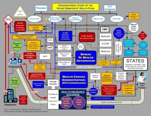
The example of organization charts was given as a good place to start. Most org charts are designed to show people and titles and reporting relationships. They often look like little inverted trees with boxes and lines and type. Tufte argues that the boxes are unnecessary due to uniform spatial properties of type. Let the words be the boxes. By removing the extra lines we obtain room in the chart to describe the reporting relationships between individuals. Since no two reporting relationships are ever the same, why do we use the same line punctuated by an arrow head to describe every one of them?
Another point that is relevant to the example given above is to use contrast with purpose. Subtle shifts in contrast are sufficient to register a change. Drastic shifts create dissonance and often have the unintended consequences: you see the pattern created by the drastic shift and not the information. As a rule, use the smallest perceptible shift to signify a change. The org chart above is attempting to describe the the House Democrat’s Health Plan. This is an example of how not to do it.
Detail Clarifies – Supergraphics
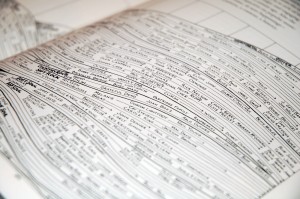
Supergraphics are high resolution graphics that display many layers of data. Maps are the ultimate example. Data is organized and layered systematically and presented economically. Supergraphics are dense, yet elegantly concise. They permit multiple readings and access points.
Tufte offered an example of a time map of musicians and genres for the late 20th century as an example of a rich, multivariate data set that no two people would read the same way. The information is dense, but it employs and elegant syntax that is very easy to access. The emphasis here is on causality. One can quickly see how genres succeed, grow, beget other genres and die. It tells many stories and the viewer is free to craft their own version.
Zero Out the Format
Maximize content reasoning time by removing barriers to accessing the content.
This applies to many different design disciplines, not just presentations. Think of Steve Jobs and his obsession with removing the buttons from Apple products. Here, the objective is to simplify the complexity of the interface to it’s bare minimum. The emphasis is placed on the content, not the means of accessing the content.
Google’s recently released automated search results that update as you type, are another example. Hitting the search button has effectively been engineered out of the act of searching because the speed that search results can be returned is approaching infinity.
Take advantage of the massive processing power of the human visual system
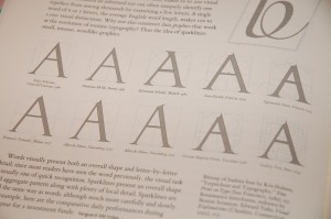
Think for a moment about typography, the system of design that controls the shape, clarity and character of words on a page. It’s a highly specialized discipline that has been around since the invention of the printing press. It’s important because the human eye is sensitive enough to register very subtle differences in the shape of a character. Designers strategically exploit this sensitivity in their work.
Spark lines

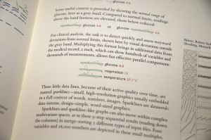
These are another great example of zeroing out the format. Spark lines are data graphics at the scale of type. They are designed to be read with speed and ease. The format is simple, elegant and minimal – no scales or axes or legends required.
The point here is that two variable graphs don’t always need to take up the whole page. It is only due to the resolution limitations of PowerPoint that they often need their own slide. The benchmark for this kind representation are the sports or stock market pages of a newspaper. People are willing and able to read small dense data sets. Spark lines offered an opportunity to incorporate data directly into the body of the text.
There was much more to the presentation than I have covered here, but I think that I’ll save it for another post. For now, here are a few points to remember:
- Chartjunk: seek and destroy. By removing the 3D and drop shadows from your pie charts, your graphics will attain an air of professional detachment and credibility.
- Focus on depicting causality and action.
- Use supergraphics to draw in your audience and tell a story.
- Zero out the interface.
- Spark lines are a great way to pack relevant data into your prose.
To conclude, here’s a final reminder:
Remember the scientist’s caveat. Present what you know from the data until better data comes along.
-Edward Tufte


